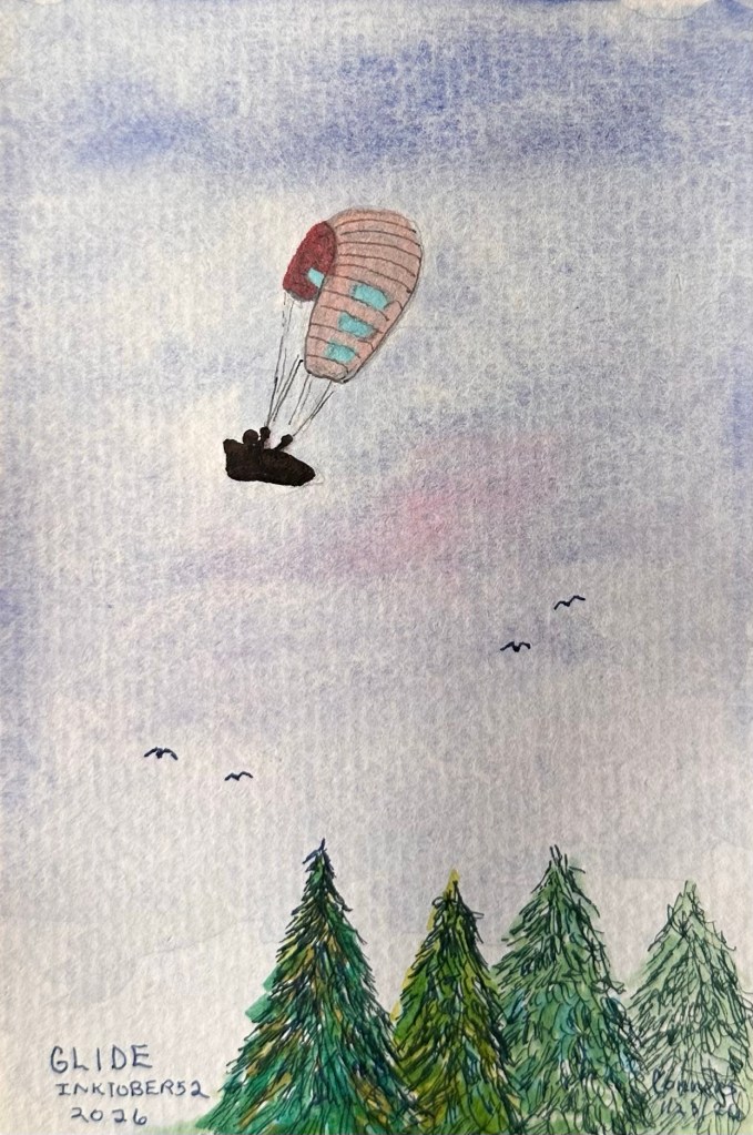
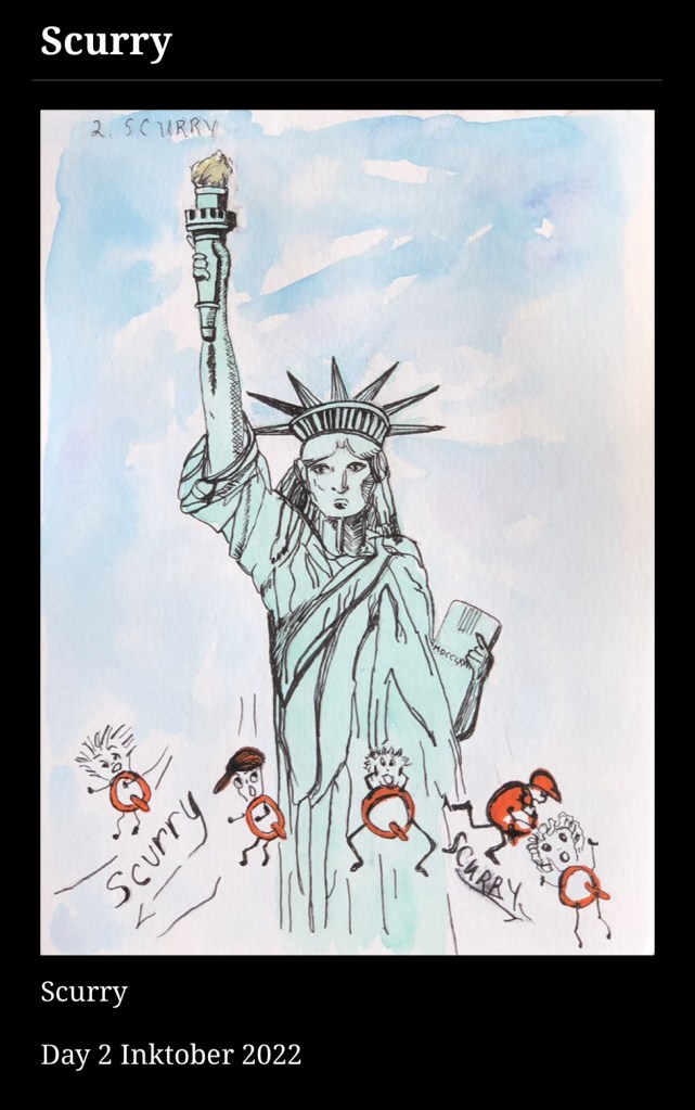
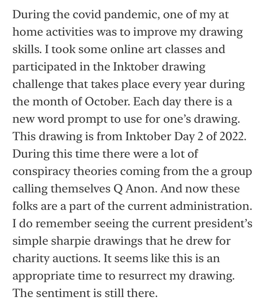
One drawing a week is not to difficult to accomplish. It has been 4 years since I participated in Inktober52.
Art of Carol Ann Conners – Coastal Northern California
One drawing a week is not to difficult to accomplish. It has been 4 years since I participated in Inktober52.
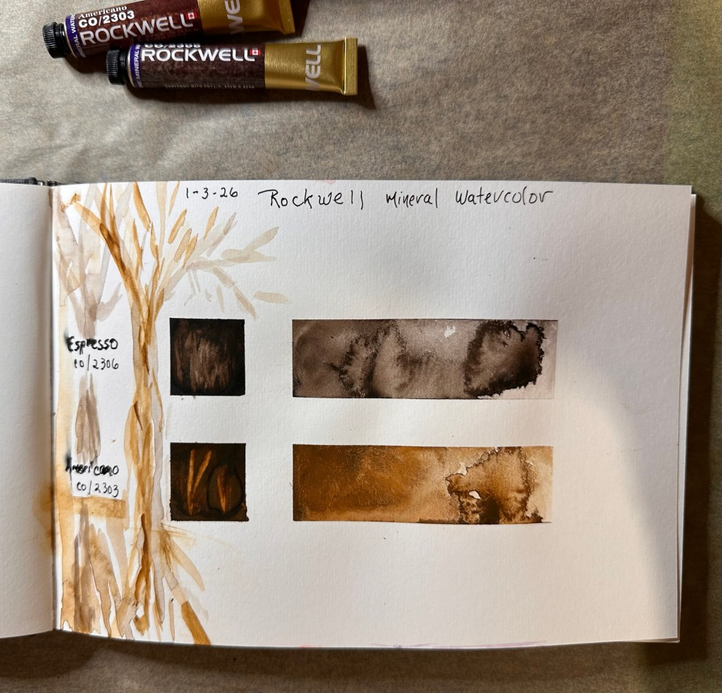
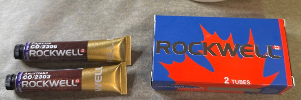
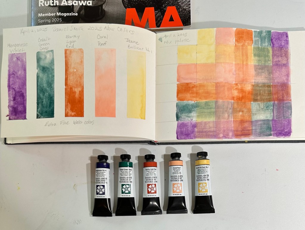
I have been waiting to try out these new mineral watercolor paints by Rockwell. They were on sale through Sketchbox.
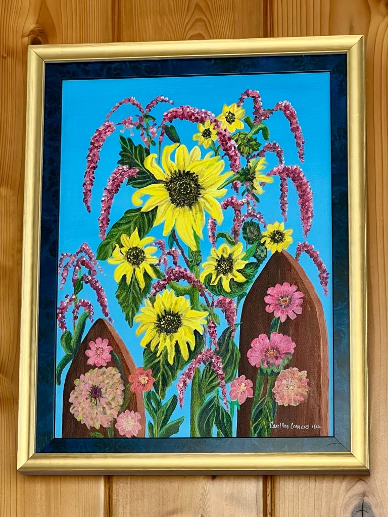
Zinnias, Sunflowers and Kiss-Me-Over-the-Garden Gate
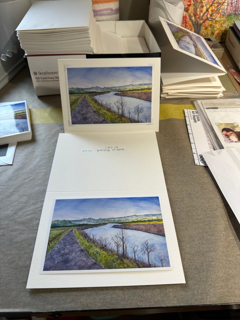

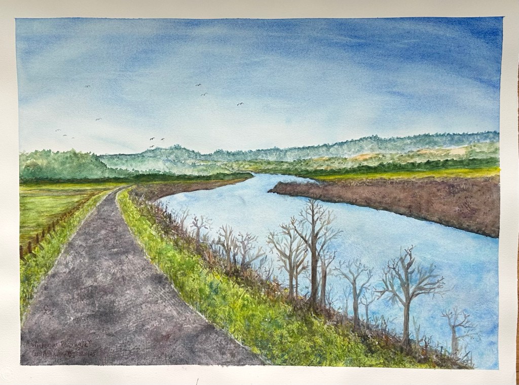
I am assembling my holiday cards using photos of my painting, Winter at Riverwalk (22”x30”).

Winter at Riverwalk is on display during the month of September 2025 at Aspect Framing Studio and Art Gallery, 520 Frederick Street, San Francisco, California
May 5 – June 9 2025
10” x 14”
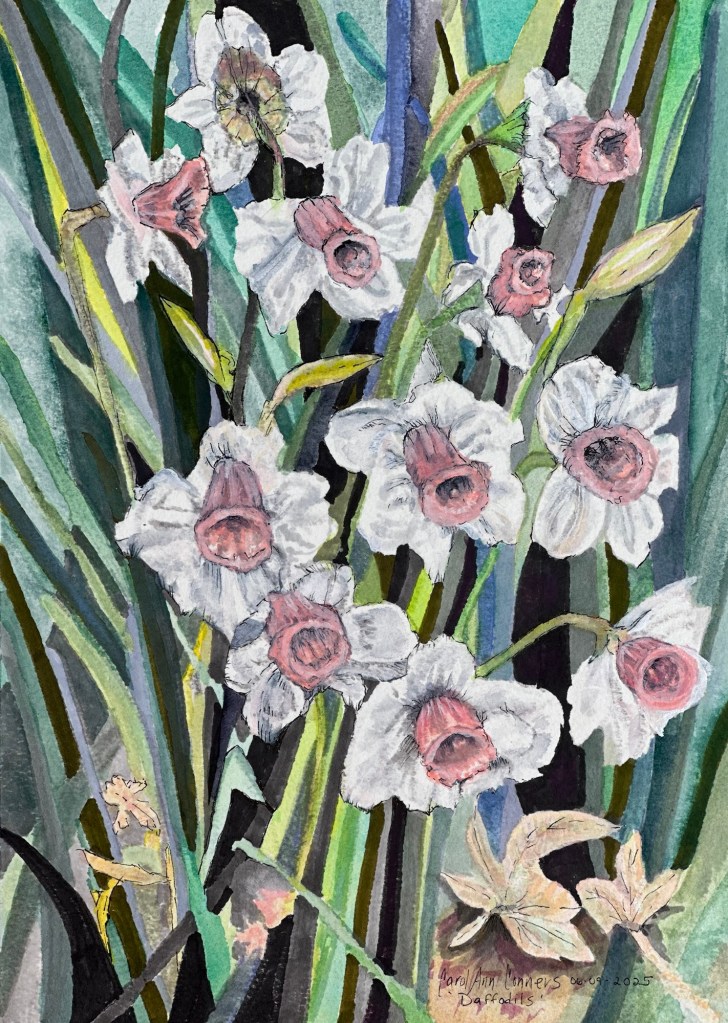
Featuring new Daniel Smith 2025 watercolors, Copic Gray Shades pens, and gouache on Arches 300 lb Cold Press cotton block.

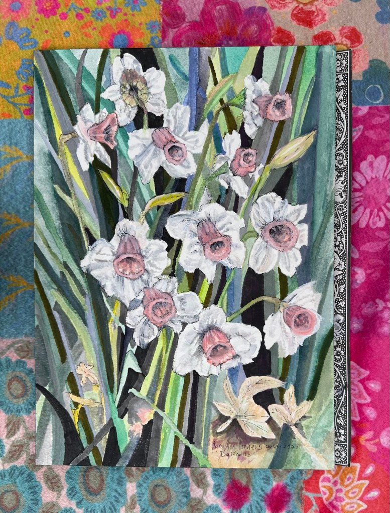


Winter at Riverwalk
Watercolor on 100% Cotton – The Langton Prestige 22” x 30”
Riverwalk is along the banks of the Eel River in Fortuna, California.
I painted with a variety of brushes, as well as with some natural materials to create texture such as burlap, sticks and asparagus ferns.